

Image hover is the effect which is based on flipping the image when the cursor hovers on it. It creates a great opportunity to add interactivity to elements on your website. With the help of our tools, you can not only add the color overlay or animation but also make additional elements appear on hover.
This is how it can look on the published site:

Adding an image hover element
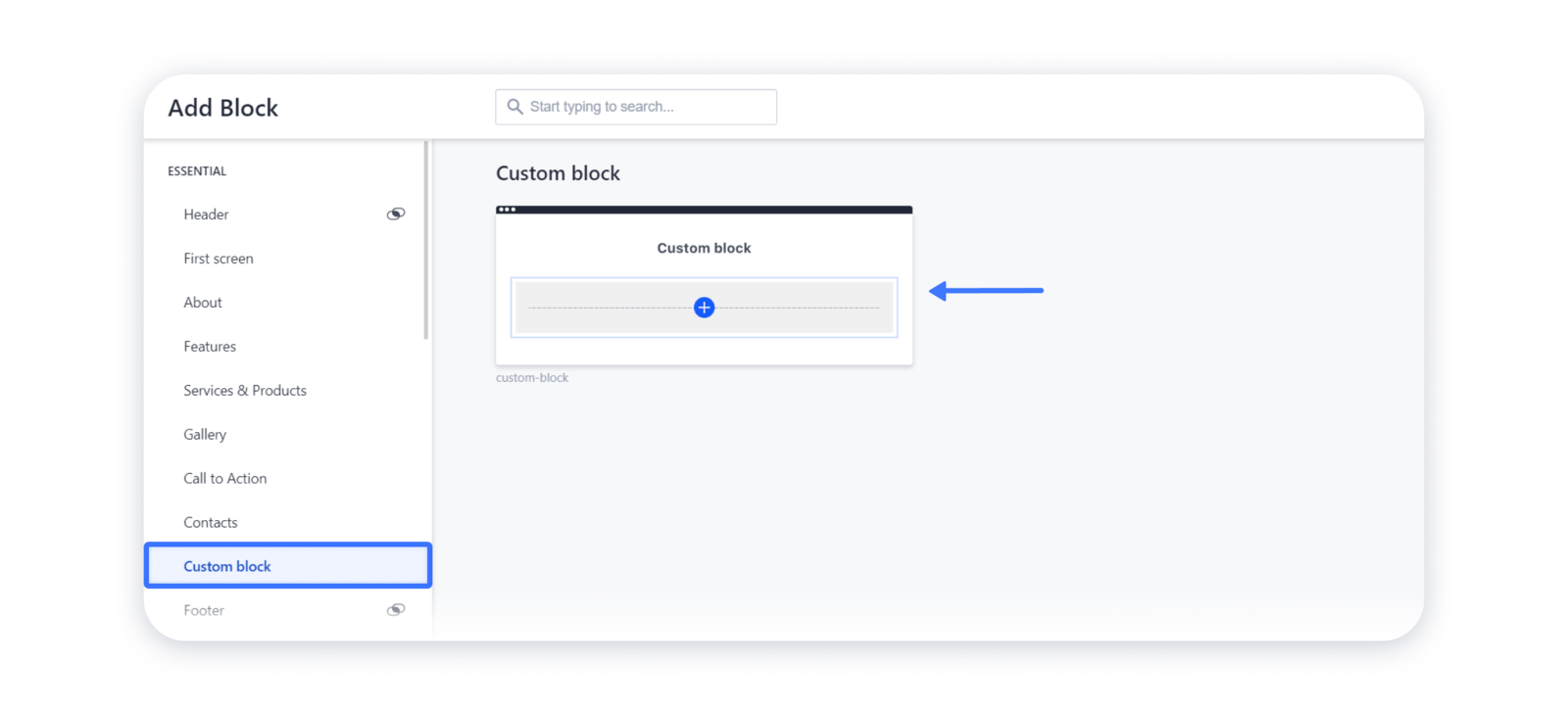
1- Firstly, choose the Custom block from the block gallery and add it to a site:
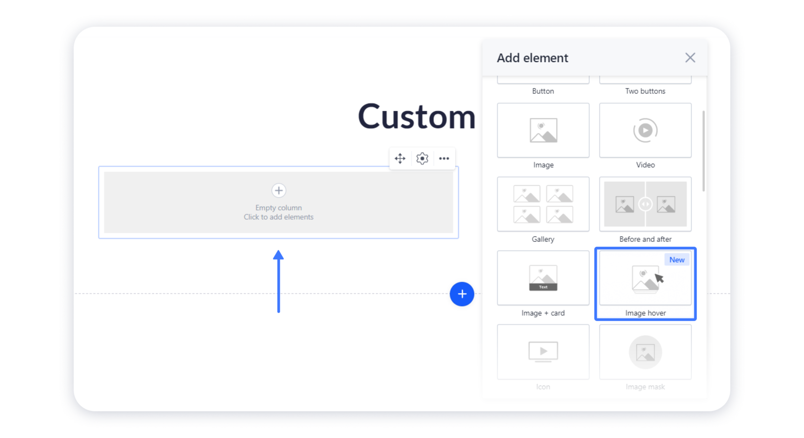
2- Hover over the empty column and click on it to add elements, then choose the Image hover in the pop-up window:
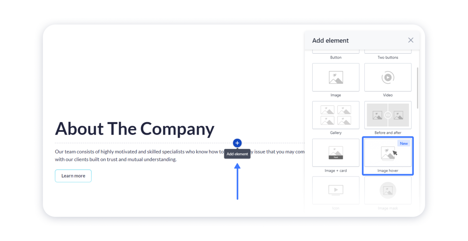
... OR add the Image hover as an element to some existing blocks:
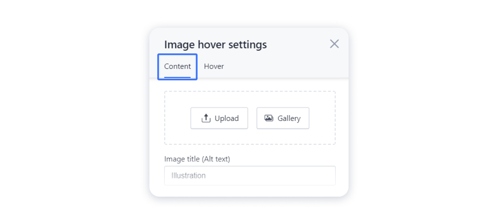
Managing the content
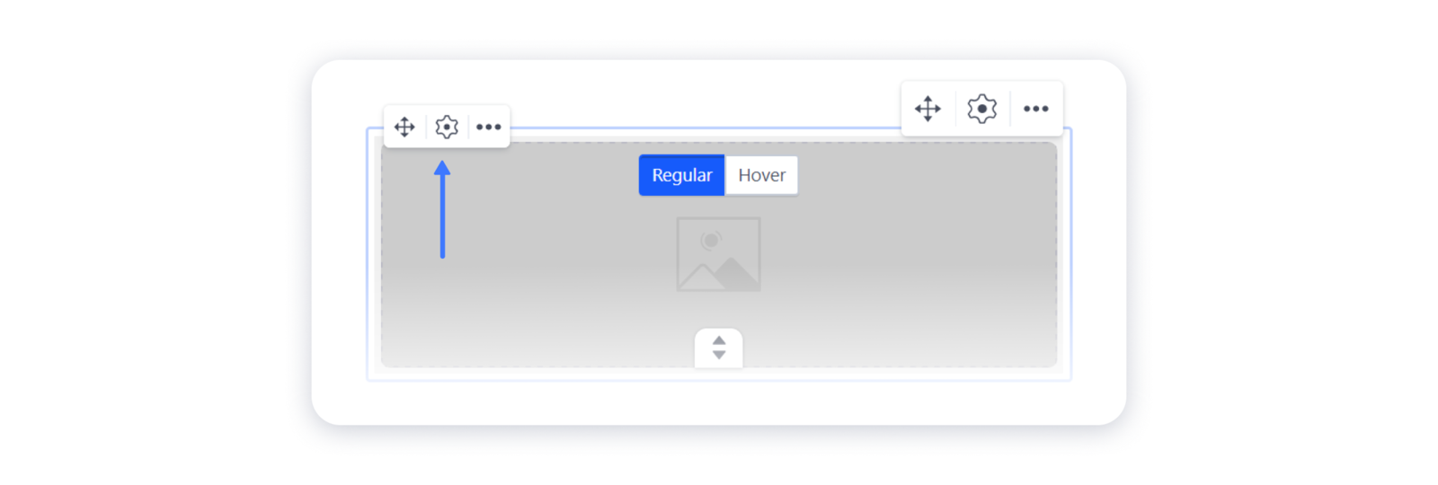
1- Roll over the element and click on the 'gear' in the top left corner to open the Settings:
2- In the Content tab, upload the image or choose it from the gallery:
3- After you set a photo there, you can edit it with some customization options — e.g., applying filter or color overlay:
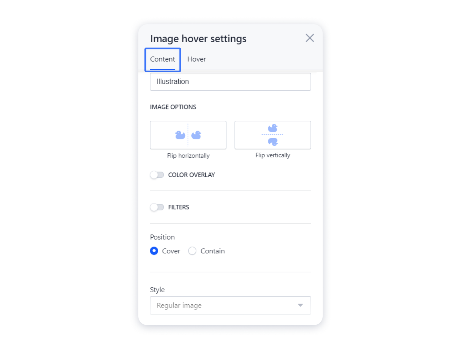
Tip: check the article Editing images for more detailed information on how to customize your image.
Adding the hover effect
1- Proceed to the Hover tab in the Settings:
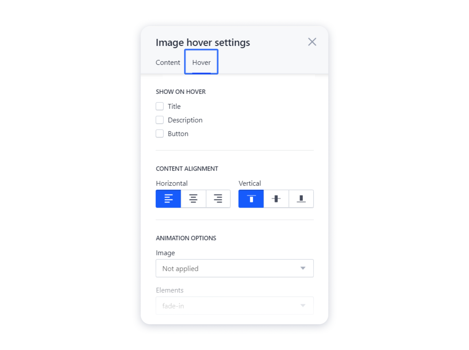
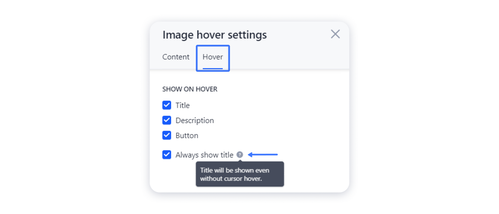
2- Here you can toggle on the elements which you want to appear after users roll the cursor over the image — title, description, or button — and change its alignment as well:
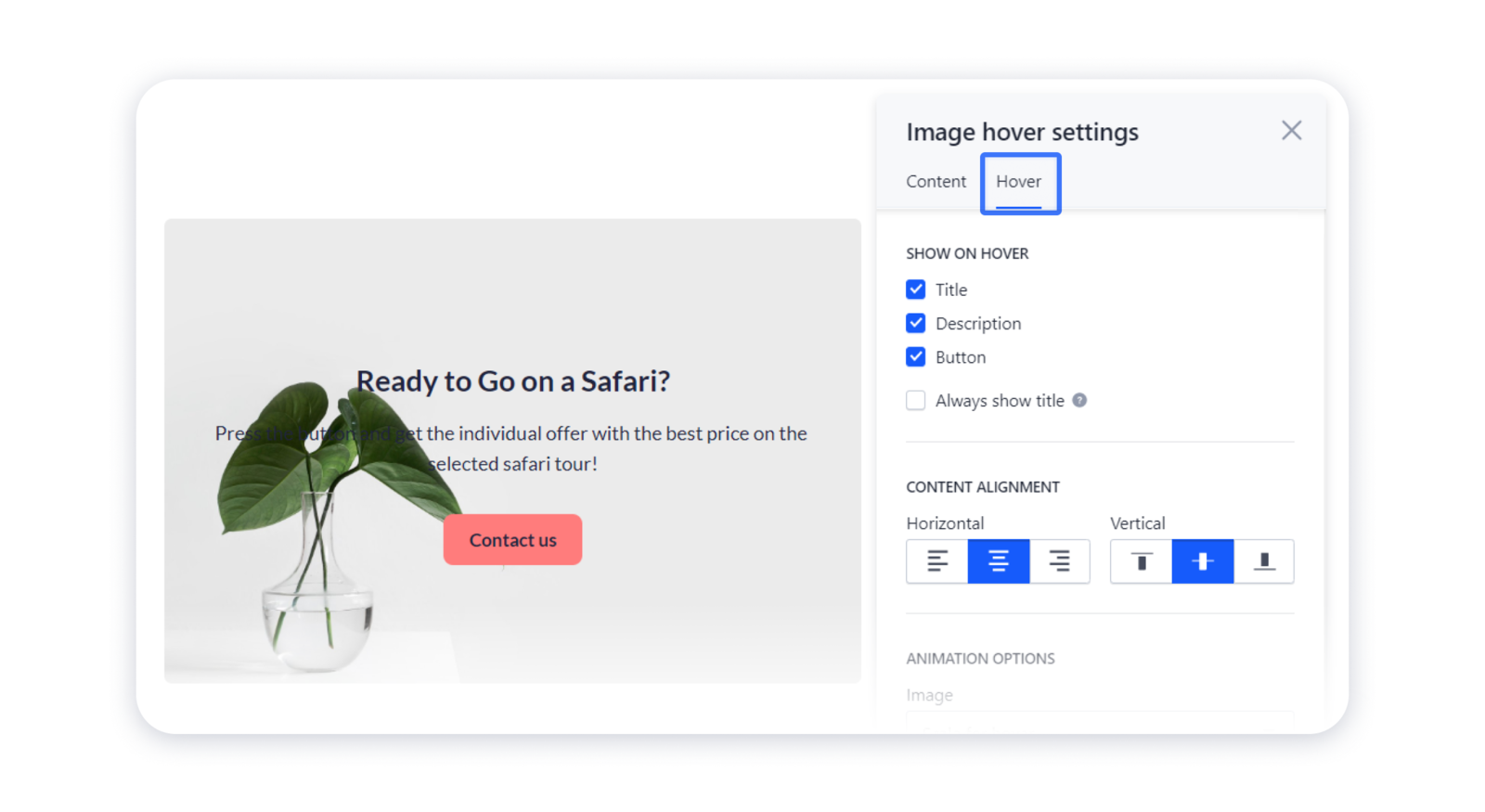
Note: you can make the title show even without the cursor hover:
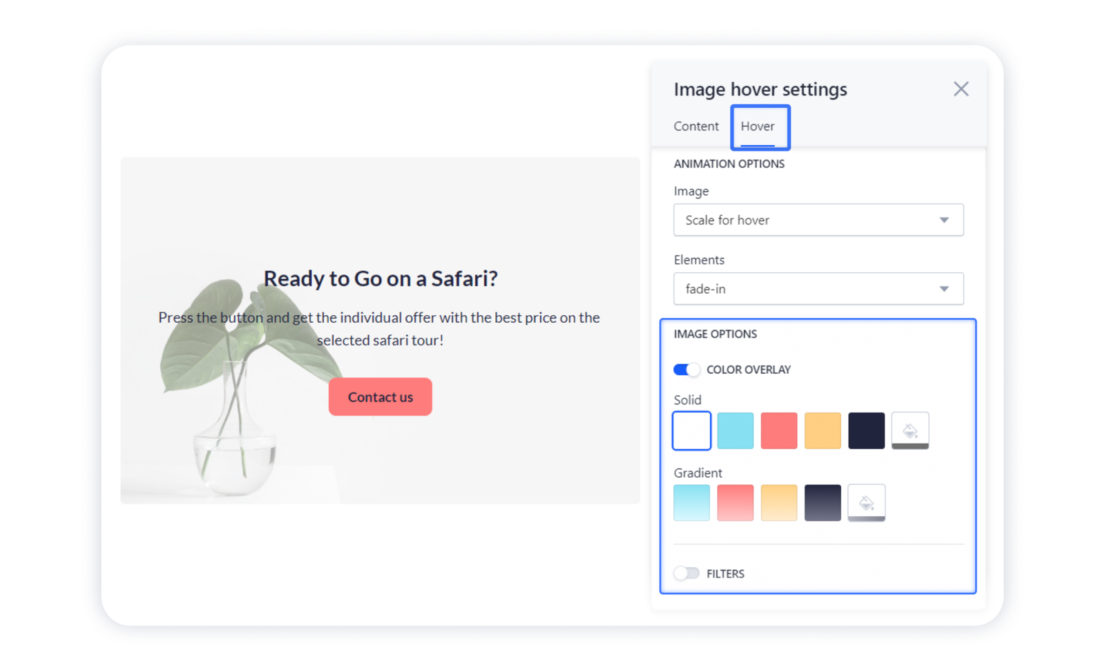
3- You can also add the color overlay or filter to your hover for a better representation of the text:
Adding the animation
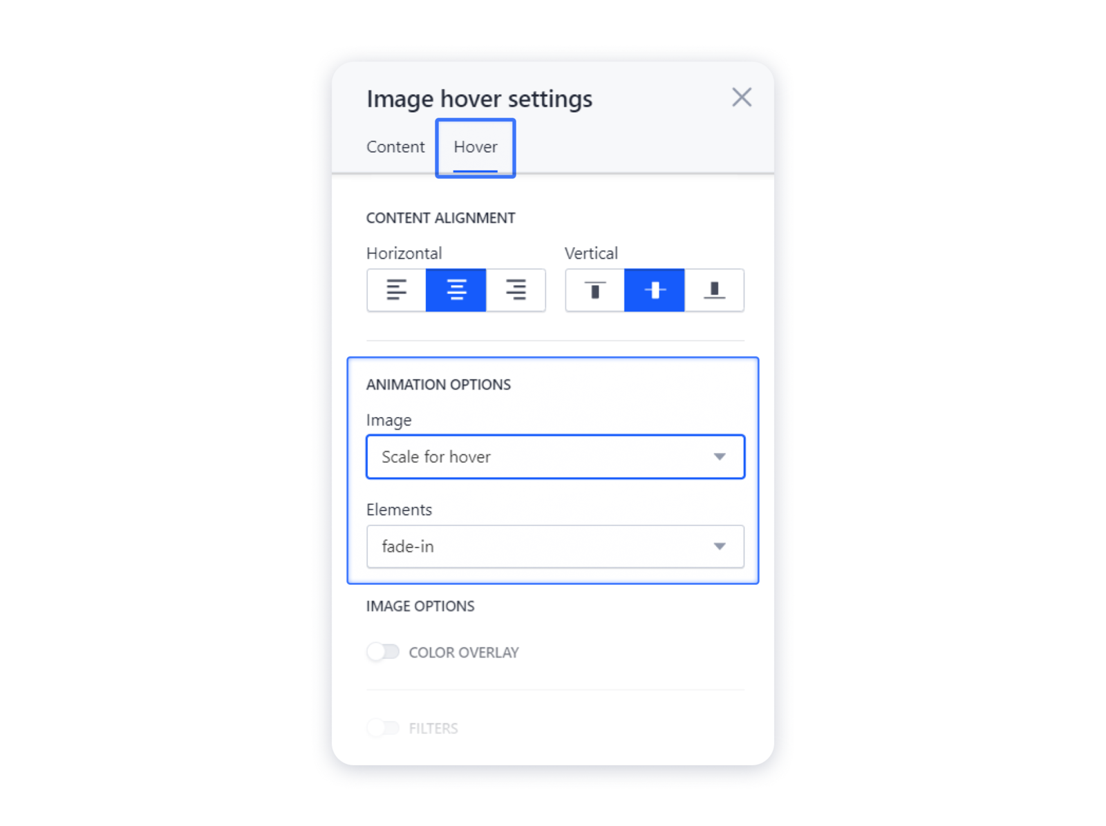
1- In the Hover tab you can adjust the animation settings for the elements and the image itself:
2- Don't forget to publish your site for the changes to appear live.