Some blocks on tidma contain list items — a set of elements in a row that are fully interconnected. That being said, if you delete a button in one item, it will be deleted from others too. This simplifies the editing process because you don't need to individually adjust each element — the overall shape and design remain identical.
List items line up horizontally and can be used for organizing content on your page. For example, if your site has a large amount of similar information — a description of subscriptions, services, a list of open vacancies — you can quickly and easily organize it using the list items. This way, the information will become more readable for users, and you can stick to unified website design.
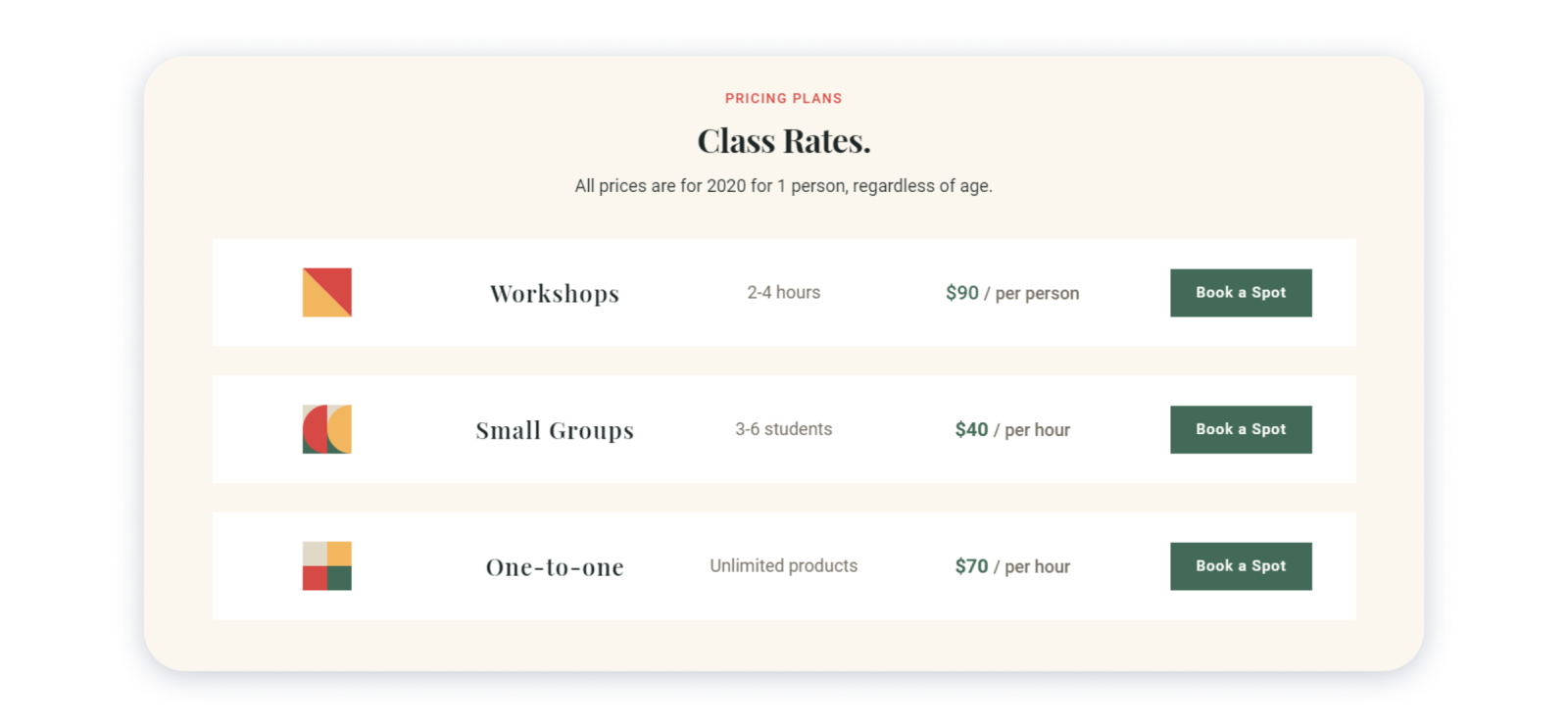
Here's a great example of the list items in action: To add a list on your site, choose it from our blocks gallery — you can find it in such blocks as wireframe-series-3-pricing, wireframe-series-1-partners, wireframe-series-17-projects, etc. Follow the instructions below to see how you can further manage your list items.
Adding a new item in the list
By default, most blocks with lists contain 3-4 rows. If you have a significant amount of information that you want to place in a list, we recommend adding more items. This way, they won't be stacked in one place, and the site will generally look neater.
1- For that, hover over the existing item in the collection and click List item in the bottom right corner:
2- You can duplicate or delete the items by clicking on the three dots in the top right corner:
 3- Drag the item to the desired position by clicking on the direction arrows icon in the top right corner of it:
 Note: you can move items of the list only within the block they are added to.
Changing the layout of the items
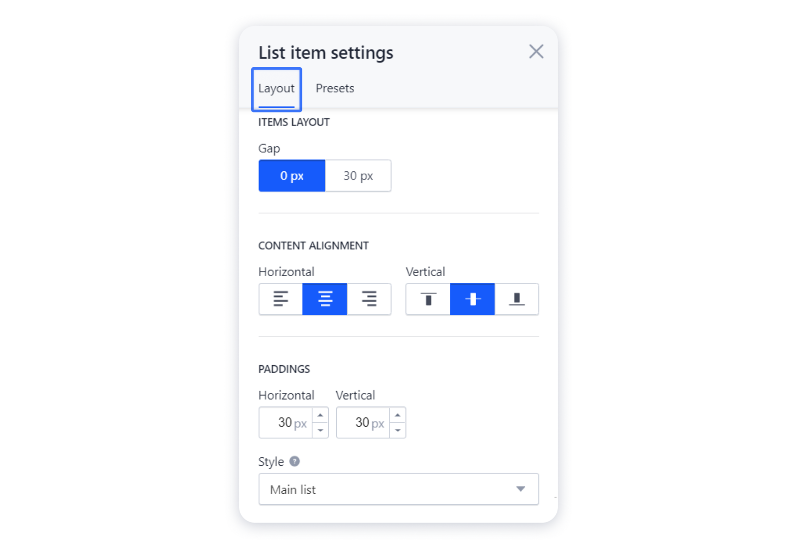
After you have added a block with a list, you can edit the layout of its rows — delete or add paddings between them, remove borders, and so on.
1- For that, hover over the list item and click on the "gear" in the top right corner to access its settings:
 Bear in mind that there is no possibility to change the width of the list.
Important: remember that the changes in the Layout tab that you apply to one item in the list will automatically apply to every item — therefore, if you change the content alignment or the paddings in the settings, they will be changed in other items as well.
Changing the background of the items
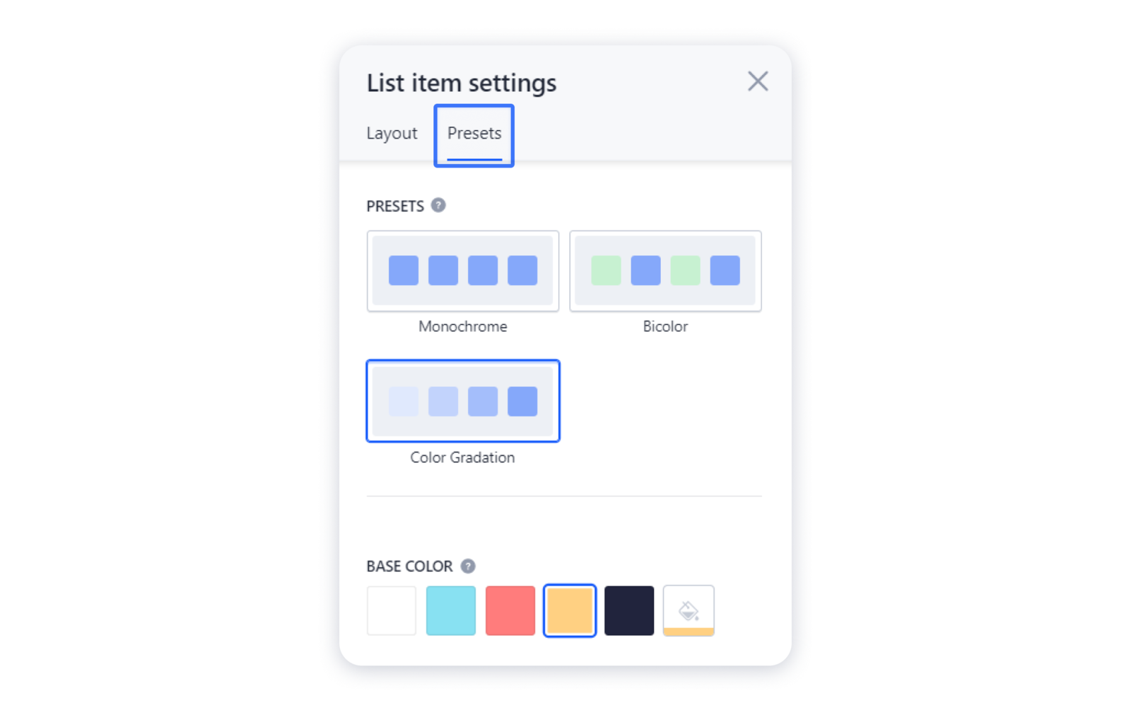
1- For that, hover over the list item and click on the "gear" in the top right corner to access its settings: 2- Navigate to the Presets tab and choose the suitable preset — the basic coloring algorithm for your items, and change the default colors to the preferred ones:
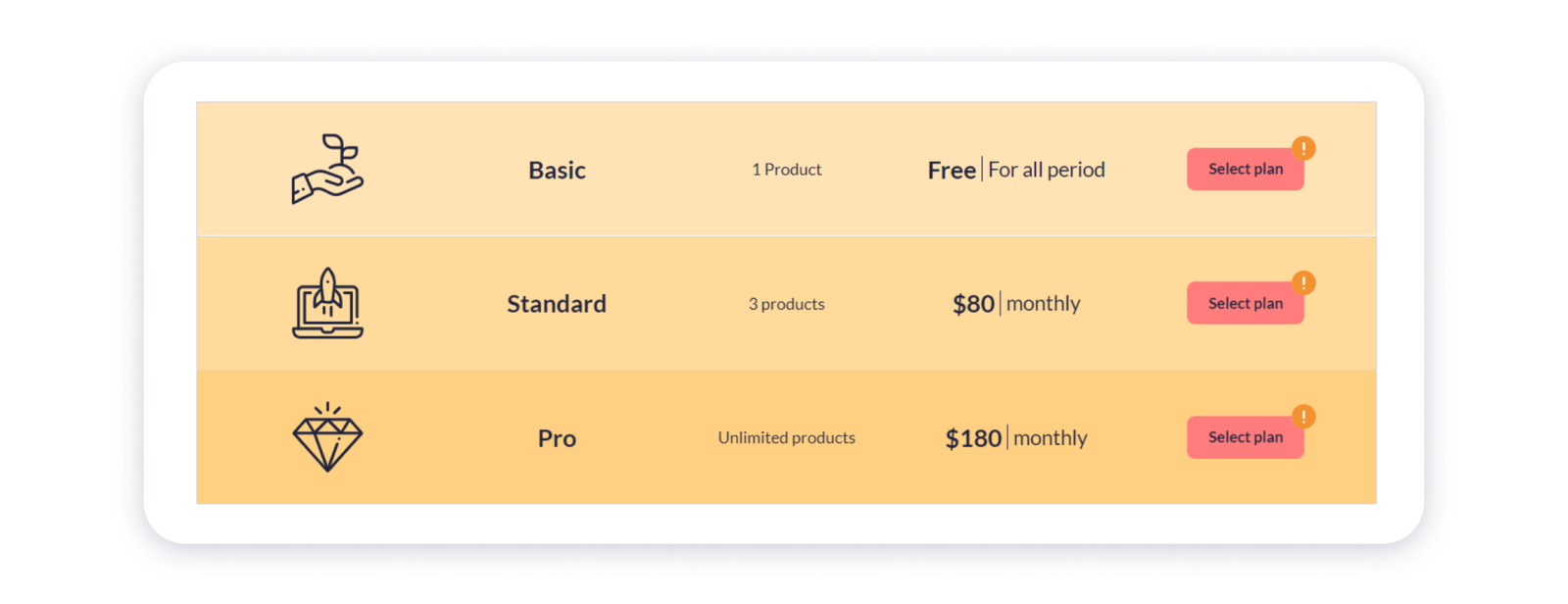
 Here's an example of how your list can look like with the Color gradation preset:
Adding elements in the list
Each line in the list consists of containers where you can add all the elements available in the gallery — pictures, buttons, text, and more. Containers in a list cannot exist without an element in it, so they are not displayed in the editor by default. The number of elements that can be added to the container is not limited.
Remember that each item in the list keeps the same layout as others — if you add an element from one item in the collection, it will be automatically added to every item.
1- To add the needed element to it, hover over the empty section and click on the "plus", then choose the element in the pop-up window: Important: maximum number of boxes in a row — 8, minimum — 2.
2- After you've added an element to the box, you can supplement it with other items by clicking on the "plus" sign near the particular section: 3- You can also adjust the width of the boxes using the dividers that are placed next to them. To do this, hover over the empty space between the boxes, click on the divider and drag it to the needed direction:
 Important: the dividers that allow you to change the width of the boxes appear only if 4 or fewer elements are added in the item. If more than 4 elements are added in the row, all boxes will have the same width.
You can also move or duplicate the elements in the items.

